


Click on the image below to see the App's complete interaction flow.
[Caution: Large file]
Detail App flows

2015-2016
After brainstorming & requirement gathering workshop with key stakeholders, an outline for the initial version of the platform was created. We were clear that the aim for the first version was:
1. To introduce the service and mental model.
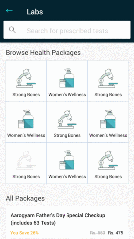
2. Cover the two primary use-cases: Prescription and Prevention. Catered as individual tests and suggested health packages from multiple labs.
Taking a Mobile first approach, we decided to build the platform in the order: Android app(largest audience) -> iOS app -> mobile web -> Responsive desktop web
A patient who is prescribed tests by a doctor, comes to the platform knowing exactly what Product is needed. Choosing the right lab is most important in this scenario. After some research, we found this decision is usually made on the basis of either a pre-established trust in the brand, ratings & reviews, or price.
This flow was thus highly search-focused.
Whereas, when another health conscious user decides to take a precautionary health check, the primary motive is to find, not only the right lab, but also an appropriate set of tests that will indicate his current state of health.
In this scenario, we chose to let the user browse through and pick a Package.
After picking the tests and lab, we gave the users a quick checkout with stored lists of Patients and Addresses used previously. Our repeat users were able to choose and book their tests in less than 30 seconds!
While the entire 1mg website and app went through a brand overhaul, we reflected on how the users had been using this section through the analytics data.
One of the many lessons we learnt, was adding categories for browsing Packages. As the platform had grown, it had become quite impossible for people to pick something relevant.
A blaring insight was that 30% of the users were only managing to book ONE test at a time. Placing multiple orders, even when we allowed them to search and book multiple tests together.
We had to get ourselves to the eCommerce mental model of a Cart, or a place to add tests one at a time, and then finish(Checkout) the booking.
The difference with 1mglabs was, adding a test to this "cart" would be just like framing a search query. A test was not a sellable unit unless you picked the lab you wanted it done from. The primary purchase decision would be made after adding to cart.
Not only was it different to think about the cart for diagnostic tests, our implementation was faced by the challenge that the 1MG app already had a cart for pharmacy in place and it would take months of technical effort for it to be able to accommodate tests. Two separate carts in app were clearly a NO.
The solution was to create a placeholder, but avoid any reference to a Cart. The CTAs chosen to be "Book" instead of "Add to Cart". Keeping it as far as possible.
It would be a floating bar at the bottom of the screen that appeared once the user had selected their tests.
The conversion rate grew by a third after this change!
Another thing we noticed was that people were booking tests that required overnight fasting in the middle of the afternoon, and then cancelling once they realised that on the booking confirmation page. This information was highly prominent on the package detail page, but most people booked directly from the listing.
We put this information right where it affected the user decisions, along with the time slot picker.
The most important aspect of getting a diagnostic test for any patient is knowing the results. Our next step was to make that experience better. Know more..
Click on the image below to see the App's complete interaction flow.
[Caution: Large file]

Detail App flows